About Me
Hi! My name is Bruno Zhong. I am 11 years old. I know eleven programming languages: HTML, CSS, JavaScript, Python, Go, C, C++, Java, C#, Kotlin, and Swift.
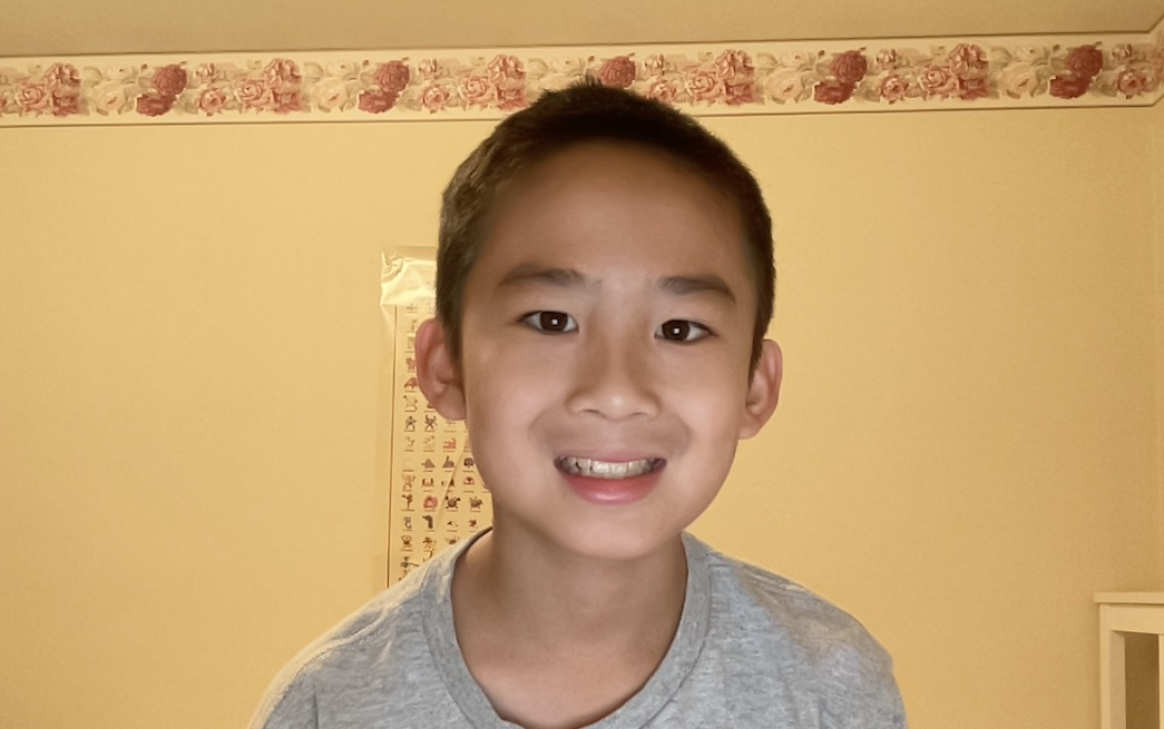
Hi! My name is Bruno Zhong. I am 11 years old. I know eleven programming languages: HTML, CSS, JavaScript, Python, Go, C, C++, Java, C#, Kotlin, and Swift.